Lots of exciting features coming up across A Blush of Rose from London, Paris and New York as Fashion Month gets under way.
First up an interview with Victoria Stapleton of Brora Cashmere.
Brora: When a passion for Tweed and Scotland meets 21st Century innovation.
Scottish Cashmere is one of the internationally best known and loved British Fashion products and finds a warm place in hearts and wardrobes around the world. With innovations coming each season, it's no sleeping giant, fresh approaches to using fabric are created and big name collaborations with designers from the London Fashion Week schedule brings Scottish textiles to the catwalk and worldwide media attention.
One of the brands leading the charge is Brora of Scotland the company founded by British entrepreneur Victoria Stapleton who is the hands on head overseeing the running of the business and is Creative Director. She is a winner of the Verve Cliquot Business Woman of the Year Award and combines flair for design and business acumen.
I was delighted to speak with Victoria and discover more about her journey founding Brora and building it into one of the best known cashmere brands in the UK. Speaking with her I got a strong sense of a woman who is both creative and has a sharp understanding of commercial reality and would surely be a role model for many young men and women starting out in business, not just in the fashion industry but beyond.

Beauty, Grace & Style
By Angela Cliffe
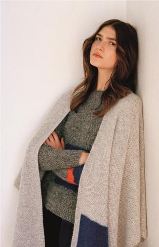
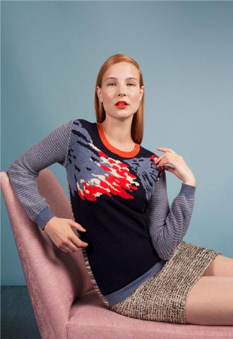
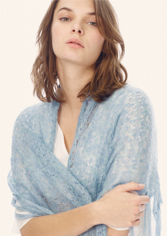
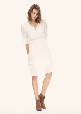
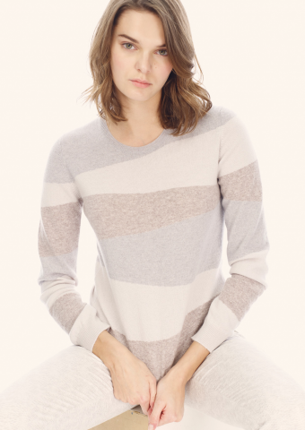
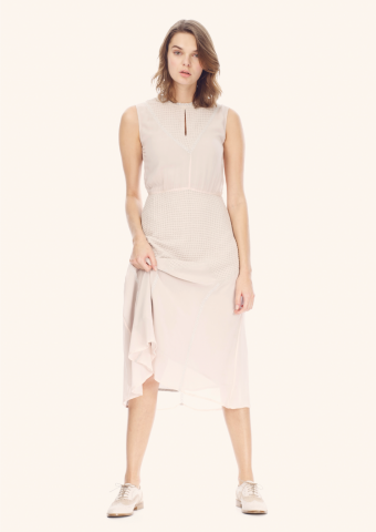
Looks from the Spring - Summer 2016 Brora collection debuting on Feb 8th 2016. Below images with kind permission of Brora.
Looks from the Spring - Summer 2016 Brora.
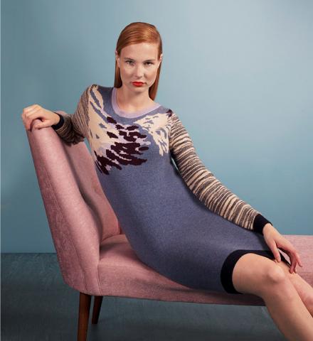
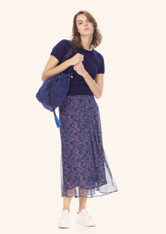
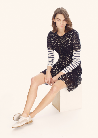
Looks from the Collaboration of Brora and Michael van der Ham. Images with kind permission of Brora.
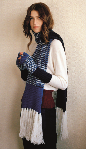
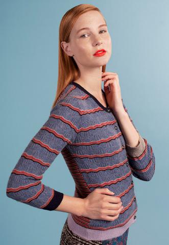
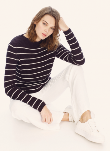
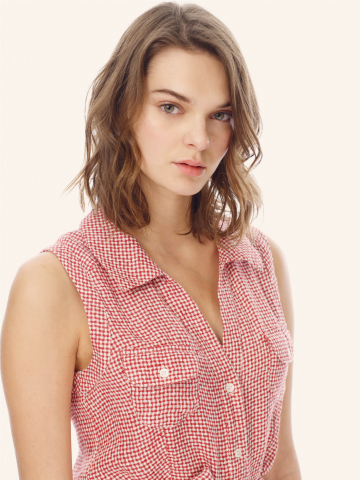
Looks from the Spring - Summer 2016 Brora.
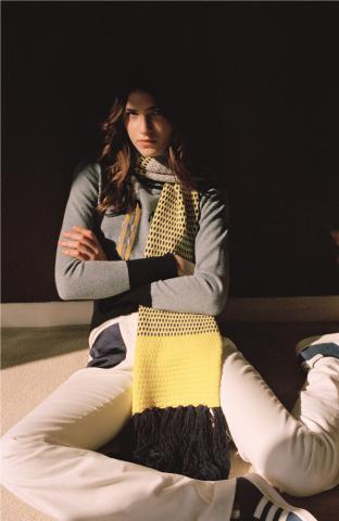
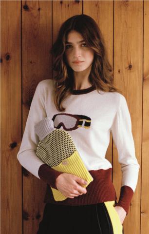
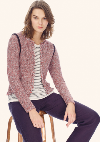
Looks from the Collaboration of Brora and Eudon Choi. Images with kind permission of Brora.
Ethical and sustainable Fashion is talked about widely these days but this has been a a key founding principle of Brora for Victoria since it began 23 years ago making it an early pioneer amongst the brands visible on the High Street today. Brora Cashmere originated at the Brora Mill in Sutherland in the Highlands of Scotland whee Victoria's family bought an interest in the 100 year old Hunter Brora Mill and worked hard to aide it's redevelopment and growth into a thriving enterprise.
Through working in the Brora Mill herself; Victoria came to learn many parts of the manufacturing process and develop an understanding of the cashmere itself and it's nature and properties. Scotland is dotted with different seed beds of Tweed and Cashmere production from Romantic Islay to Historic Howick in the boarders showing that fabric production itself is woven into the national identity.
Victoria is a closely involved now as she was at the outset 23 years ago and just as then, each collection begins with colour followed by mood boards drawing on themes and inspirations. The colour palette is key to the foundation and everything grows from there. Her business began initially in a Studio in Parsons Green in London where friends modeled her early pieces. She borrowed an extra telephone line from her friends to take orders as word spread about Brora and like all entrepreneurs put in very long hours to ensure that her client base could be satisfied.
Brora's dynamism has been enhanced with engaging guest designers in collaboration and some of the leading designers showing on the London Fashion Week show schedule have been in partnership with Brora. In recent years Victoria has collaborated with Louise Gray, Michael van der Ham and Eudon Choi to create collections that fuse their own unique design inspirations with the flexible adaptable nature of cashmere and tweeds.
The experience for collaborators of working with Victoria and Brora is full immersion. It all starts with a trip to Scotland to see the manufacturing process and the steps of tweed and cashmere production. For Louise Gray, a Scottish girl born and bred, it was somewhat familiar territory but for Michael and Eudon it was a voyage into a new world of fashion that they very much enjoyed.
Eudon was introduced to Victoria by a friend and he became fascinated by the archives of the mill and the many different stages of production and became fascinated by the Mill archives absorbing as much information as possible during his time on site at the mill and through learning from the experience of Victoria.
Victoria's launch party for the Eudon Choi + Brora collaboration in Autumn 2015 hosted faces from Scottish design such as Issy Tennant who's sister, Model and co-designer, Stella Tennant is also a friend of the brand. More family and friends filled Brora's store in London's Sloane Street to help celebrate the launch in an echo of the spirit of how Victoria founded her label. The 70's skiing theme of the collection was in perfect sync with the mood of the season and this lighthearted yet focused collection offered. It was true partnership with Eudon providing design work and Victoria giving advice on style and form. From there they both looked at first and second samples and the collection evolved naturally.
Will this influence spread to his future collections at London Fashion Week? Let's wait and see but Eudon can now add expertise in cashmere and British heritage textiles to his Fashion repertoire. This also sits perfectly with one of the hopes of the British Fashion Council that more British Fashion Designers will work with British material manufacturers and businesses supporting skills and employment and the heritage part of our textile industry across the United Kingdom.
With a new boutique opening at Edinburgh Airport in 2016 Brora is all set for exciting times ahead as a brand that is both growing it's presence around the world and providing a vital tangible link to the traditional production and manufacturing base of the fashion industry.
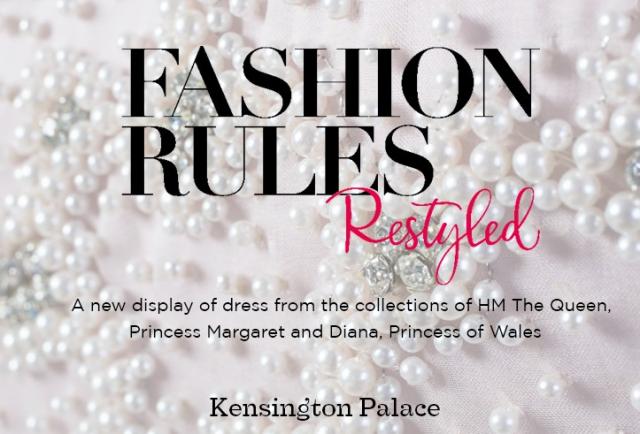
Fashion Rules: Restyled at Kensington Palace.
In February 2016 Kensington Palace relaunched one of their most popular fashion related exhibitions of recent years Fashion Rules: Restyled. It's a fantastic insight into the wardrobes and paints a picture of the place that Fashion and the rules of Royal Fashion have in working Royal life.
A life in the public eye carries many responsibilities and while wardrobes of leading women of the British Royal Family and others are key indicators of taste and vital tools of diplomacy in their own right. Fashion is a powerful medium of communication that gives glamour enhanced and enjoyment to the wearer and also crucially has many levels of significance; touching trade, manufacturing as part of it's role in Statesmanship. A crucial part of Royal History, a term I first coined on this website about 4-5 years ago when the first exhibition was launched is 'Diplomatic Dressing' . This method of dressing for events and functions on the international diplomatic stage is a crucial part of Royal Ceremony and life and key to understanding the role that they Royal Wardrobe plays.
The power of spectacle of Royal dressing has long been understood by many Monarch’s in recent history beginning with Queen Victoria’s uncles King William IV, a passionate advocate of the Theatre and like his elder brother George IV they and their great nephew Edward VII had a strong sense of visual impact that influenced everything from state ceremonial; the remodeling of Buckingham Palace to the clothes that they were seen wearing on public. But enough of the gentlemen, that’s just the background as the spotlight here belongs to the ladies.
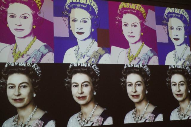
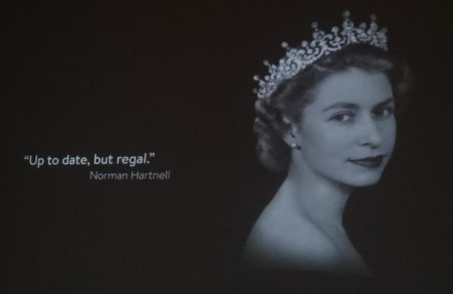
HM The Queen Elizabeth II
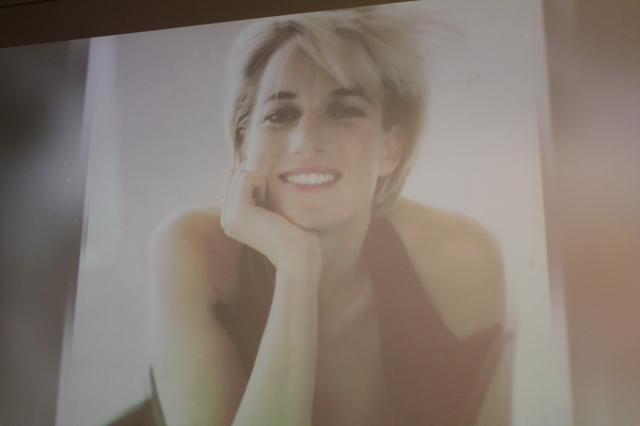
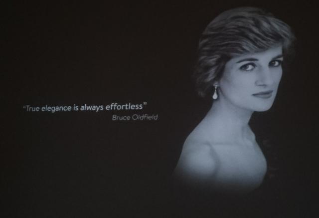
Diana, The Princess of Wales. Princess Margaret.
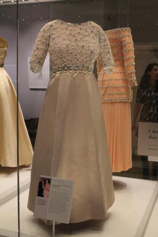
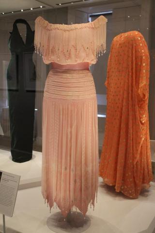
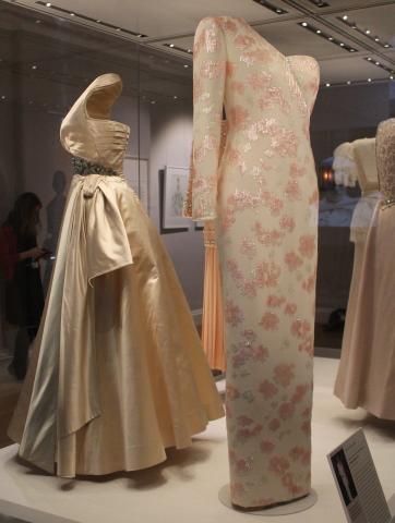
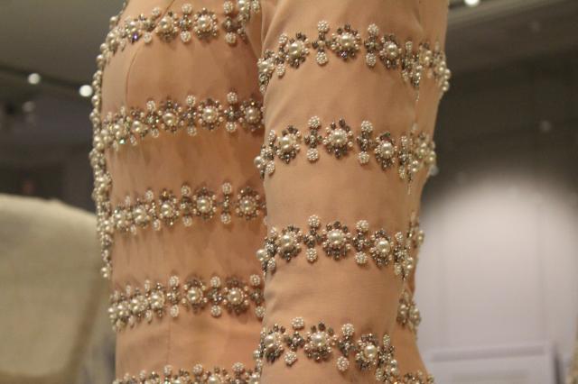
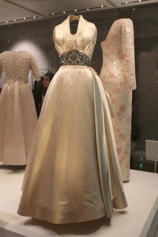
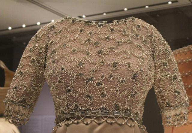
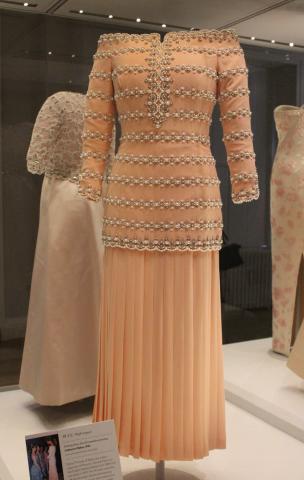
Fashion Rule: High Impact Dressing. Above are two dresses designed by Catherine Walker for the Princess of Wales for engagements in the early 1990's. Both of these dresses are completed with the exquisite detail that the couturier Catherine Walker is renown for. Catherine herself ensured that Diana was dressed in the way that she expected for official and diplomatic functions in the UK and overseas and was the longest collaborator with the Princess during her public career. Outfits would often be planned months in advance with Catherine suggesting forms and styles that would suit the Princess. The Salmon coloured dress above was created in 1993 and was worn by Diana to a Gala with the English National Ballet of which she was a patron from 1989 to 1997. Like so many pieces in this exhibit you really can study the detail and the embroidery with pearls sewn so delicately is masterful work.
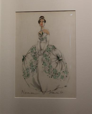
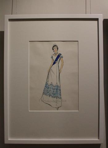
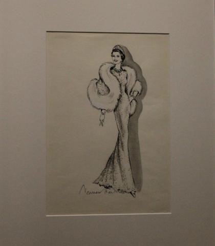
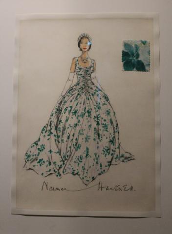
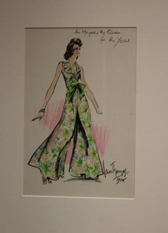
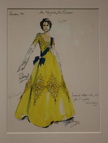
One of the most fun 'Behind the Scenes' aspects of fashion is looking at the beautiful Gouaches and sketches of dresses that designers submit to their clients for consideration. This exhibition features a wonderful collection from Normal Hartnel to Hardy Aimes and Ian Thomas. What I really enjoy is seeing the 'conversation' between the designer and the client, above Her Majesty the Queen, where the designer in particular Mr Thomas jots down his thoughts in quite an open conversational style suggesting where the outfit could be worn and with his stylistic ideas in mind.
Above to the left this dress was worn by H.M. The Queen was created by Hardy Aimes in 1972 and she wore it in that year for a state visit to France and also chose it later in 1977 for the official portrait to mark her Silver Jubilee celebrations. The bodice of the dress is heavily embroidered and shows fantastic detailed beadwork. This is one of the most famous outfits worn by The Queen and featured on the Silver Jubilee mug presented to British school children and on the cover the sex pistols album and the famous series of prints by Andy Warhol.
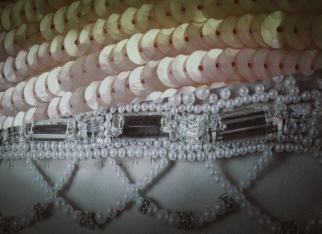
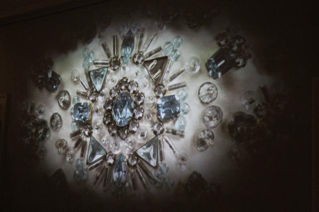
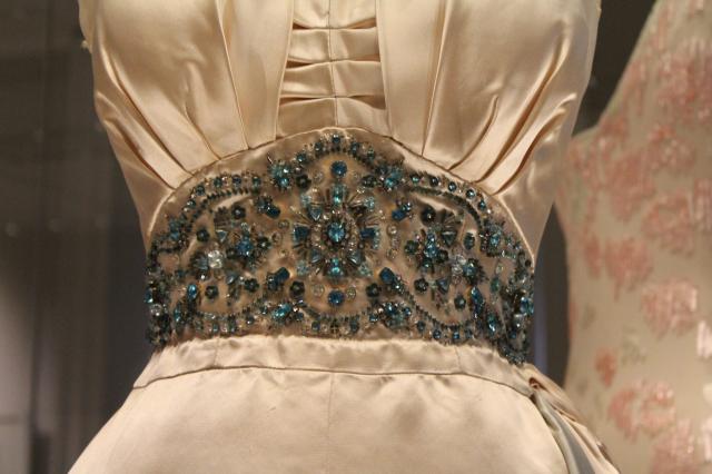
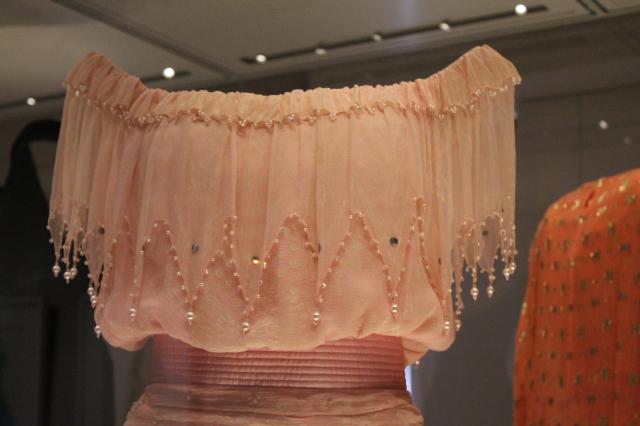
The dress centre above in silk and satin was made by Normal Hartnell in 1951 and worn by Princess Margaret to a film premiere in London and to a dinner in Paris given by Prince Paul of Yugoslavia. The beading at the waistband presents a striking impact and gives more than a touch of Hollywood glamour that the princess was so well known for and was highly reported in the news media when it was worn. Below I've included another shot of this dress in close-up to show the detail of the beading.
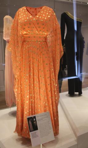
Above to the right a dress by Catherine Walker from 1991 in Ivory silk crepe with sequins. It was worn on a state visit to Brazil for a dinner at the Itamaraty Palace given by the Brazilian President. Brazil had just lost to Argentina in the Pele Cup and so as to be mindful of not referencing this she chose delicate colours that had no relation to the national flags of the teams. Diana often favoured the asymmetric dresses with the single shoulder or sleeve that could strike the balance between current trends and a formal black-tie or white-tie dress code.
They are very beautiful and I suggested to some of the Kensington Palace press team, and one of the curatorial staff as a joking passing thought that these Gouaches and sketches could also form the basis of an exhibition of their own or perhaps a book of sorts. I think it's well worth considering as these drawing, some with original samples of fabric attached to them make a fantastic archive and record in their own right. I also very much like the way that the Queen is always smiling in these pictures bringing her character to life on paper.
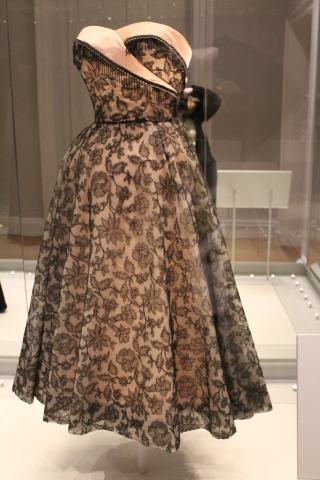
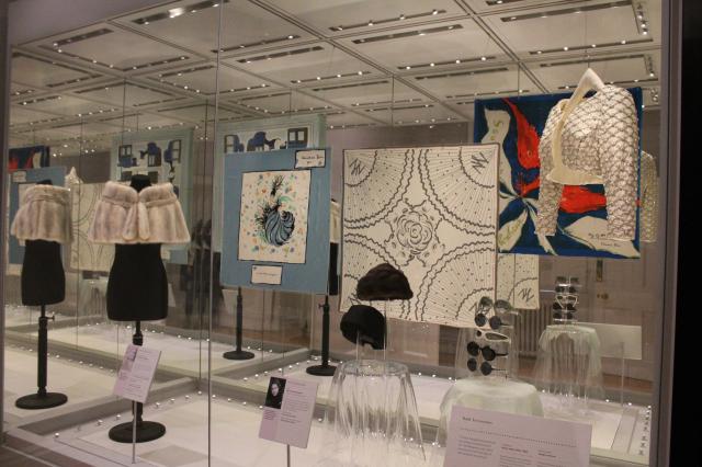
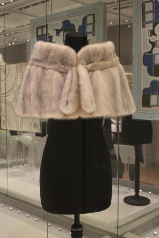
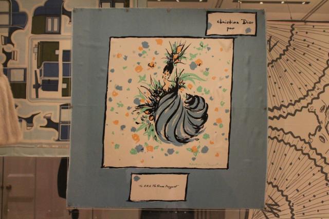
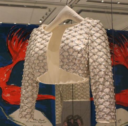
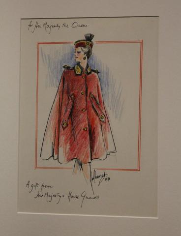
Fashion Rules: Bold Accessories. Another very important part of dressing for the public eye is the selection of accessories. Above to the right is a beautiful display celebrating the taste of the late Princess Margaret. She was one of the members of the Royal family who was keen to patronise French Couturiers as well as British designers and her wardrobe included many beautiful pieces such as a fur wrap for the shoulders and below a bespoke silk scarf made for her by Christian Dior in Paris. The use of beading and satins catches the lights of the cameras perfectly and is especially useful in the composition of outfits that are to be worn for the evening. The bolero-style jacket to the right with pearls and jacquard detail is a very flexible piece that could be combined with many outfits.
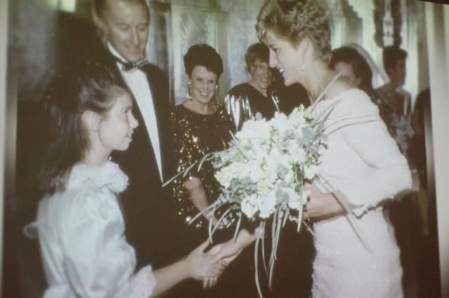
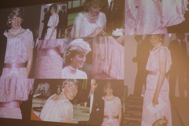
There are lots of great freeze images running across the walls of the exhibition room and I've included here a few images of Diana, Princess of Wales wearing some of the dresses featured in the exhibition. I think these images show how the dresses where both enjoyable and comfortable and designed to serve their purpose.
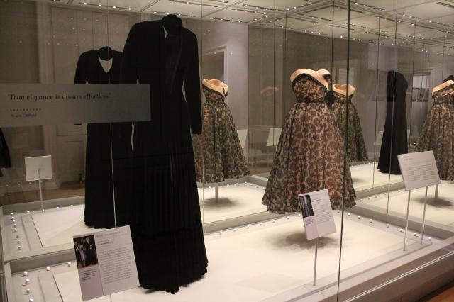
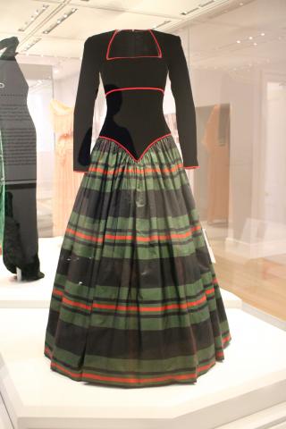
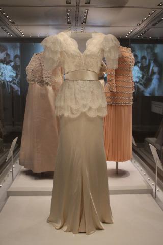
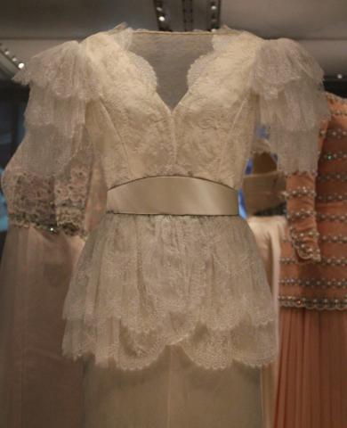
It was almost impossible to have favourites of any kind when looking at these dresses and selections from the Royal wardrobes but I felt that this cabinet below offered two examples of High Impact clothing that for me have a very special resonance. To the left a long black Bruce Oldfield dress worn by Diana and to the Right one of the many beautiful pieces by Norman Hartnell in 1952 worn by Princess Margaret. The sheer embroidery over silk and satin is also one of my favourite designs and the gauze lace over the body of the dress adds an effortless subtle sexiness to complete the feel of beauty in the piece. The fringed beading gives a touch of chic nostalgia hearkening back to the late Victorian and early Edwardian era and has distant echos of racy show-girl glamour.
Below are a series of well known outfits, the first four worn by Diana, Princess of Wales and the last worn by HM the Queen. The first look below tot he left was worn by Diana in Scotland for a ball at Balmoral and is another example of diplomatic dressing. The following two are long line pieces that accentuated her figures and gave emphasis to line. Royal women need to think about how they will look on camera and how they will be seen from a distance An element of both playing up your best features, as all women do when dressing and making a strong statement with colour are key to making the right impact.
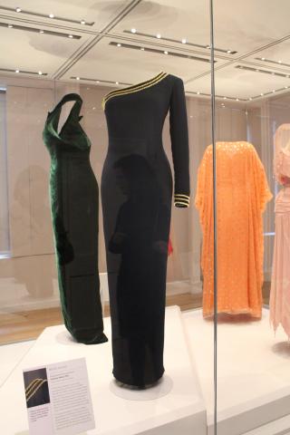
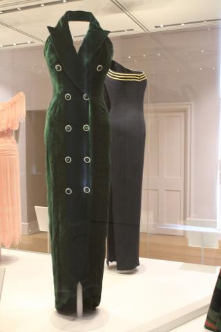
Diana favoured more simplified designs from the mid 1980's through to the early 1990's and the Fashion Rule: On Trend runs with the two outfits below by Catherine Walker in green and navy blue. The navy blue dress was worn for a private event and carried the 3 braids of gold emblem at the neckline and at the sleeve. In a faint echo of navel uniform this was a confident style statement of a woman who looked to forge her own future. To the right a beautiful dress worn by the Queen on a state visit to Dubai. As one of my fellow guests at the Press day noted it was also worn by the Queen to a White Tie reception in the City of London thus illustrating a key use of colour coordination in drawing attention to the figure.
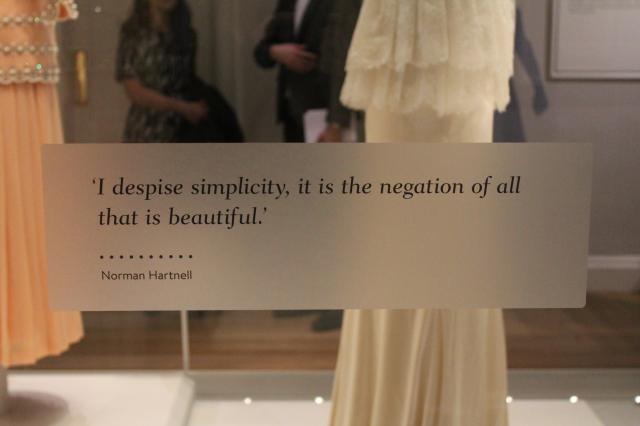
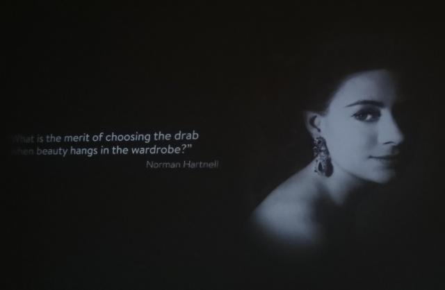
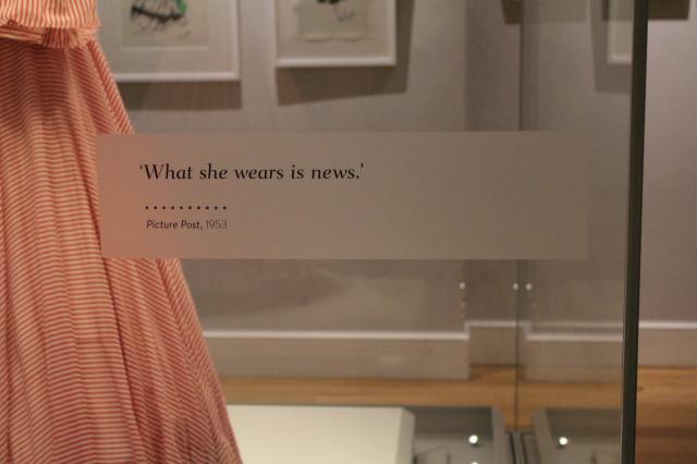
Below are a serious of Fashion Motto's that run through the exhibition display and my favourite and also I gather from speaking with Deirdre Murphy the lovely curator at Historic Royal Palaces that it's her favourite too. "What she wears is news" sums up so brilliantly what is still true for high profile Royal women today. I don't personally find much truth in Norman Hartnell's sentiment but everyone is entitled to their own view on fashion and style and it's important to represent the feelings of such influential designers.
Here below is another image taken from the freeze display that shows Diana wearing several, more elaborate dresses in the early 1980's. It shows the light pink colour that was one of her favourites during the early years of her marriage and complimented her English Rose complexion. The dress was made by Zhandra Rhodes n the early 1980's for Diana. It was designed to represent the beautiful cherry blossoms of Japan during a state visit that Diana and the Prince of Wales made to Japan and is a key example of diplomatic dressing and it's importance in Royal visits abroad and representations.
I couldn't resist also adding in some close-ups of several of the dresses that I've featured earlier on in this article. It gives a further opportunity to see more of the beautiful detail of the outfits that show them as leading examples of the heights of British Haute Couture. The craftsmanship that you can see is truly stunning they illustrate the powerful impact of using the finest textiles combined with the most skillful hands and know-how.
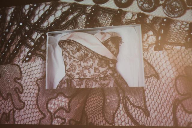
Here are some more beautiful images from the film projection in the exhibition. I found this fascinating as it showed the detail of the applique and beading with crystals very close up and really brings you closer to the design process and atelier. Everyone will come to this exhibition looking at it from their own perspective and take away from it something unique. For me it was looking at the clothes and contemplating the process producing the garment from the commission stage and conversations with the clients around the outfit requirements to glimpses of the techniques involved and the life of the garment with it's wearer and commissioner.
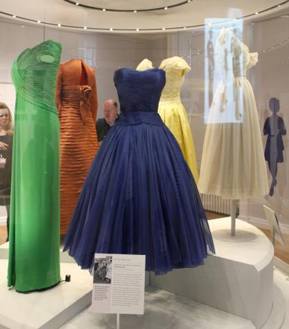
Here are a case of beautiful dresses worn by the Queen and Princess Margaret in the 1950's and 1960's. This was before the era of colour television and audiences at the time could only guess from descriptions of journalists what the true impact of the clothes on audiences would really be. The blue dress by Jean Desses from the early 1950's was worn by Princess Margaret by Ascot and has fantastic sculptured detail at the bodice and a natural lightness in the skirt.
These dresses in the cabinet shown demonstrate another Fashion Rule: Block Colour. This is another simple stylistic device that lends itself perfectly to a professional working wardrobe for the public eye. The single colour gives focus to the figure and as H.M. The Queen is well known for being well aware, it draws the eye to figure and person very neatly.
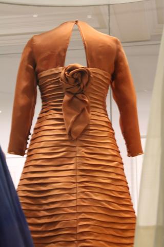
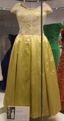
The above dress in Lemon Yellow is by an unknown designer and was made for Princess Margaret in the 1990's. The white lace embroidery across the bodice is beautifully detailed and a timeless design feature. In striking burnished umber the dress above to the right makes a strong style statement. A view from the back showing the Rose detail and pleated layers illustrates the variety of ways a dress can many stylistic aspects to draw admiration and enjoyment while sticking to the single colour theme.
I couldn't resist adding in a shot of the Queen in her Silver Jubilee tribute from Andy Warhol. This, now legendary print, features one of the dresses by Hardy Aimes that appears to have been one her favourite outfits of the 1970's for working events in the public eye.
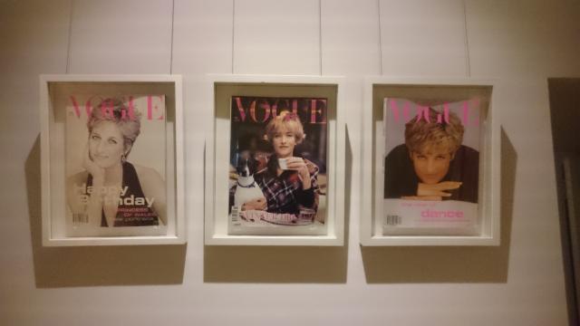
To close my look at the exhibition a shot of three of the many Vogue covers that adorn the walls of the exhibition featuring The Queen, Princess Margaret and Princess Diana either on the cover or written about inside. By a funny coincidence the Birthday covers for Diana match my colour scheme for the website. They really do have a timeless look and don't feel particularly dated.
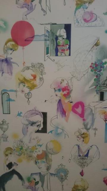
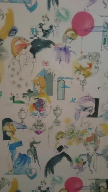
Either side as a little parting look at the palace I wanted to include the water colour images of Diana that you can find on the ground floor near the rest rooms/Loos. They cover the walls of a corridor and make a really fun installation bringing the palace to life and showing humour and playfulness through the caricature style of the interpretations. I think they're charming and one of the most delightful touches that brightens up the palace decor in Kensington Palace's new modern era.
With special thanks to the Kensington Palace and Historic Royal Palaces Press teams.
CHANEL Spring 2016 Beauty collection - L.A. Sunrise.
CHANEL are welcoming in the new beauty season with an electric burst of colour taking it's inspiration from the West Coast capital of glamour Los Angeles. I've visited Los Angeles a couple of times and recall being struck by two things, the light and the young vibrant energy of the city that sees colours bursting into life in so many places.
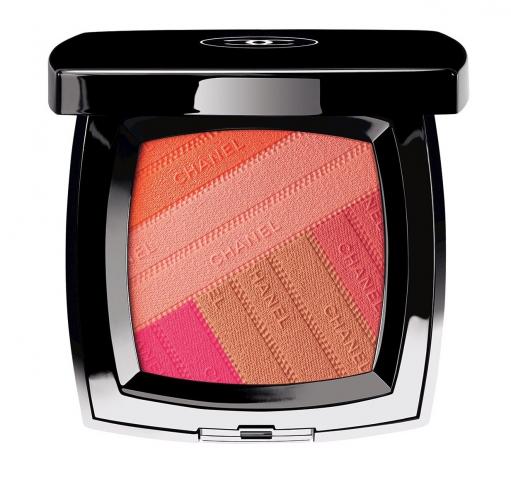
The blush palette 'SUNKISS RIBBON' has an intriguing 3D Design that many of us find irresistible to touch as well as looking almost too cute. I think lots of girls will be taking snaps of this before diving in and caressing the surface with brushes for the first time. These pretty impressions of ribbons are a draw to the eye on the beauty counter and in editorial. The colours are a heavenly sympathetic mix of both bright and warm hues that can be blended in different ways depending on how you chose to sweep your brush. You can also just use one of two colours as gentle highlighters if you wish for an added accent on the upper cheek bones and around the eyes. It's a blush palette designed to echo the rays of morning light in Malibu and I think it certainly does.
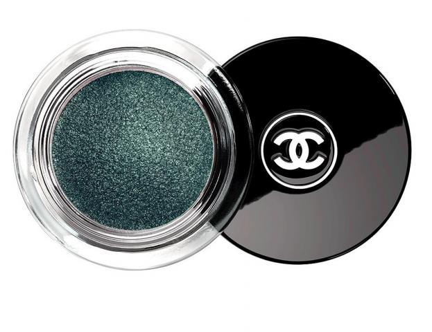
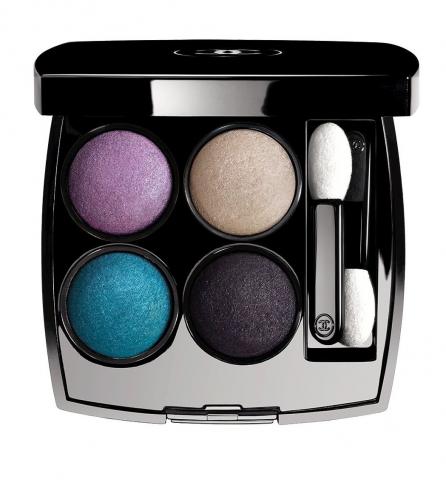
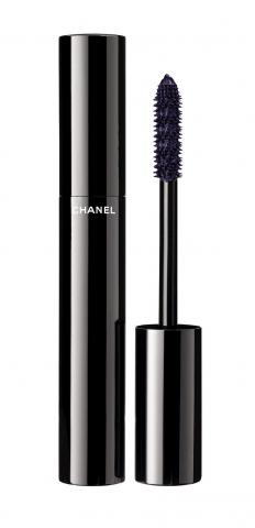
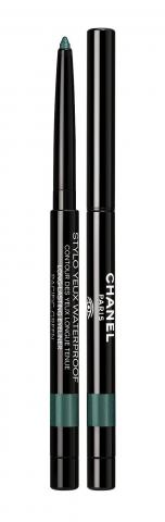
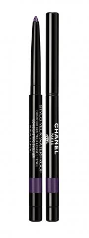
The Tisse Beverley Hills 'Les Quatre Ombres' eye shadow palette mimics the blues of the swimming pools of Palm Springs and Beverley Hills. These shades will work with a variety of eye colours and skin tones in great contrast and flexibility and offer you the opportunity to make a bold confident beauty statement. They can also be applied wet or dry to enhance the possibilities of application. Matched with the violet mascara below in 'Ardent Purple' or a more subtle Brown or Black they create a multitude of options allowing you to explore your creative side in front of the mirror.
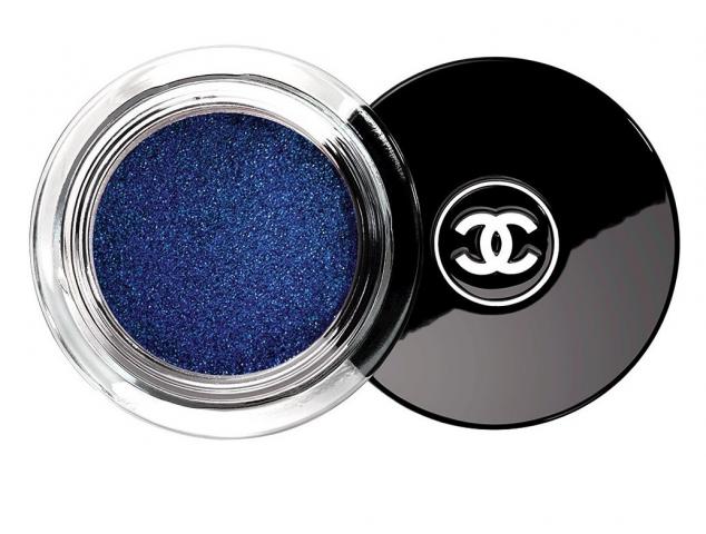
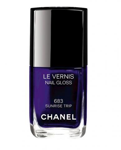
I've saved possibly my favourite part of the collection until last as the cool electric violet-blue of Sunrise Trip is in one of my favourite Midnight Blue colours that are vibrant and flattering. It's an Imperial shade to paint your tallons with and make a great statement on your hands and toes as well. I'm a great fan of doubling up with your favourite nail polishes on the toes and it's a great way to finish your pampering pedicure's.
This colour makes a great companion to the eye palettes, liners and will work well with the lip colours however high you decide to take the colour impact. It's a sophisticated colour too so you could wear it to a formal black-tie style reception with an evening dress or in more casual setting for socials, at work and at play with your friends.
This is definitely a collection that will make you shine like a star as bold colours are always a great way to show your confidence and, like all CHANEL make-up ranges, there is the subtly of utilisation of the colours in different degrees 'dressing' the make-up look up and down as much as you want. But I say Dare to Shine in the spotlight and turn up the voltage especially on evenings out as we say 'Good Bye' to winter. After a cool winter it's great to wake up to an L.A. Sunrise.
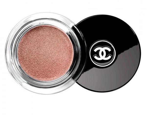
Metallic shades kiss the eyelids with this trio in Griffith Green, Moonlight Pink and Ocean Light offering three suitably bright options in keeping with the bold colour themes of this collection. There's something enveloping about this Green and it would look fantastic especially with Dark Brown, Hazel or Amber eyes. Moonlight Pink is a sweetheart colour and also my personal favourite of the trio. It's a Sea Shell/Candy Sweet colour that will suit many skin tones and work well worn in lighter or thicker applications. Being a neutral it also has the option to possibly double as a highlighter around the cheekbones.
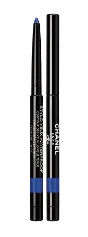
To complete your eye make-up CHANEL are offering up another trio of liners this season that compliment the Green and Blue above with Yeux Stylo in Fervent Blue and Pacific Green and complimenting the seasonal Mascara in Ardent Purple to the left there is a third liner in Purple Choc. These liners work well with the Mascara for a daring look or by adding a twist of colour to eye make-up using Brown or Black mascara.
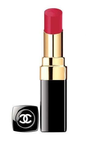
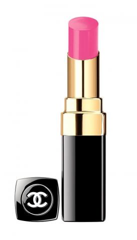
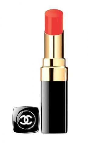
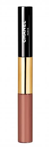
"Mwah"; it's often about the lips and CHANEL cover the remit of many options for the lips, often the most sensual and sexual part of the make-up composition and a key tool in the women's make-up collection. This season the Rouge Coco lip colours offer us three choices to suit your mood, complexion and appetite for adventure. First below to the left, Shine Energy capturing the full voluptuous glamour of the Red Carpet itself in a deep luxuriant shade of crimson to coat your lips. Centre; Shine Mighty is a fresh burst of pink that has a touch of youthful innocence about it heralding future accomplishments in store. Shine Shipshape in Coral is an energetic shade echoing the strength and passion of the pacific waves as they crash onto the shore-line. To the right is the Rouge Double Intense Gloss in Tender Beige recalling the sands of the California coastline beaches. CHANEL's glosses are highly reliable, from my experience, and this is a flexible neutral that will add a touch of shine to any make-up look.
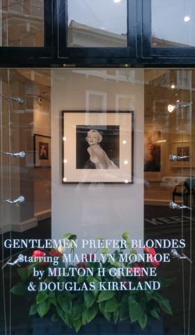
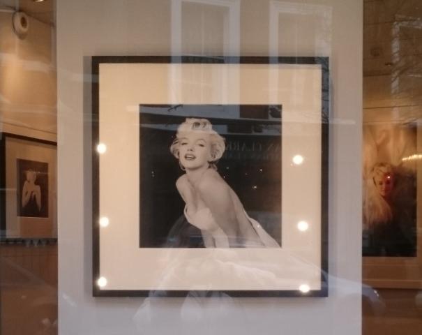
Gentlemen Prefer Blondes - portraits of Marilyn Monroe at The Little Black Gallery 13a Park Walk in Chelsea, London.
One of the most interesting photography exhibitions in a boutique gallery in January - February this year has undoubtedly been the series of intimate portraits on show at The Little Black Gallery of Tamara Beckwith-Veroni showcasing images for sale by Photographers Milton H. Greene and Douglas Kirkland.
It isn't too often that a fresh installation of a Hollywood legend comes to the capital and this was a beautifully curated series of images to see.
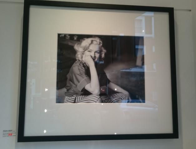
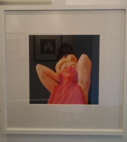
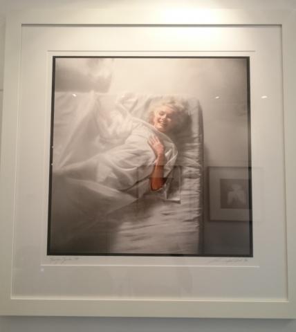
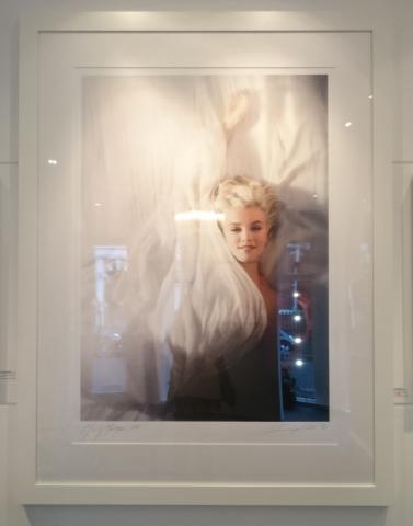
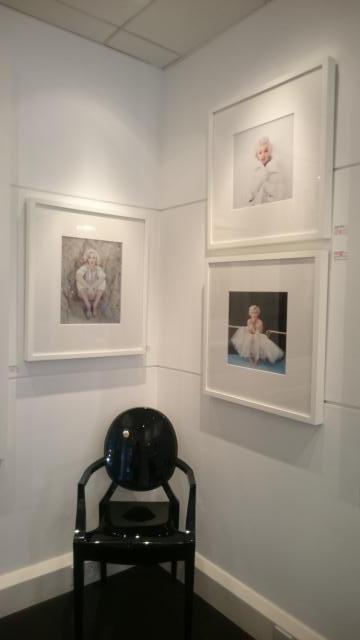
The title Gentlemen Prefer Blondes references one of Monroe's best known films and the series of playfully shot images show an actress who had a troubled life looking largely relaxed and comfortable in front of the camera, although at times her mood does become a little pensive in some of the shots.
As a former model who became an actress I sensed from looking at the images that she may have found a form of escape and enjoyment re-inventing herself in-front of the lens. Marilyn first became known in the US after modelling Swimwear on the beaches of California in the post-war years.
Milton H. Greene is best known for his work with Marilyn as well as his career as an early pioneer of colour photography and very successful High Fashion and celebrity photographer working with Vogue and Harper's Bazaar early in his career. He was also a film maker at one time co-producing films with Marilyn including the Prince and The Showgirl.
Douglas Kirkland is based in the US and one of the most famous fashion photographer's of the 20th-21st centuries to come from Canada. Still active and shooting today I urge you to check out his website for his portfolio and stunning resume of projects. He's one of the legendary Fashion Photographer's I would love to meet and talk to.
The Little Black Gallery in Chelsea was established by Tamara Beckwith Veroni, Lucy Carlos Clarke and Ghislain Pascal in 2008 and is the home of the estate of Bob Carlos Clarke with a permanent exhibition of his work exploring the boldness of femininity in contemporary photography. The gallery is owned today by Tamara and Ghislain and hosts photography from well known figures as diverse as Patrick Litchfield, Julian Lennon and Anja Niemi.
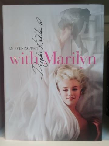
This is a wonderful gallery to visit if you're strolling through Chelsea and Ghislain is a wonderful, articulate and insightful host complimenting Tamara's feel for art and direction perfectly. I included a shot of the book that is a perfect accompaniment to the exhibition below to the left that would make great bedtime/anytime reading. Douglas Kirkland's presentation of a greater series of his image is a fantastic study of mid- 20th century celebrity portrait photography. He paints a largely sympathetic picture of Marilyn and it's hard not to drawn in by the winsome smile of Marilyn and innocent charm of girl who simply wanted to explore more of life.
No 'Dumb Blonde'; Marilyn had a broader world than many people realise from studying psychology at UCLA to enjoying simple pleasures of life by the beach and with the children of friends. An early adopter of the method of controlling her public image carefully (as well as the method style of acting) this composition of images show the Marilyn that she would like us to remember her as, a girl on the stage pursuing her dreams.
The National Portrait Gallery exhibition: Vogue a Century of Style celebrating the first 100 years of British Vogue.
On a warmer than average February evening many of the British Fashion world's leading names joined Alexandra Shulman to celebrate the opening of the seminal exhibition of Vogue Photography at the National Portrait Gallery. After a well attended Press Day and Gala public tickets where in hot demand highlighting, as if it where needed how Vogue has permiated all our lives in the last 100 years.
Curated by the fantastically experienced Robin Muir who is the keeper pf the Vogue archive with more than 3 decades of archival fashion background at Conde Nast to his credit this is a show that will teach and give so much to it's audience. Even the most ardent Fashion fan who has lived on a diet of Vogue for decades will find something new to explore here, or I'm rather certain, look at at least part of the assembled works in a fresh light.
This collection curated by Robin felt fresh and alive, a clear review of the past. 1920's cepia images from the silver screen era where given their due place , the wonderful Lee Miller's coverage representing a vital period of war coverage that as Robin has said is one of the most important parts of the collection. Seminal works like the Apotheosis of the Bicycle by Norman Parkinson show the importance in celebrating objects of everyday life.
A feast of Art work covers greeted the visitors eyes and I'm often struck by the change in the representational style of British Vogue over the Decades. To be utterly frank it's only in the last few decades that sexyness has been so overt with more wit and style appearing in earlier editions and the use of illustration. For commercial reasons we're perhaps not likely to see illustration covers return to Vogue but it's wonderful to see them.
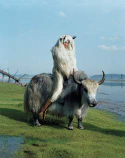
Kyrsi Pyrhonen in Mongolia by Tim Walker 2011
(C) Tim Walker
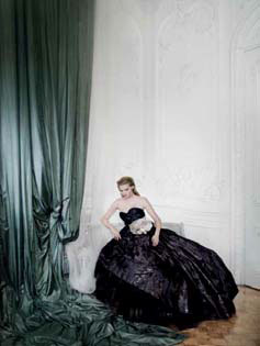
Lara Stone in Carlton House Terrace by Mario Testino 2008
(C) Mario Testino
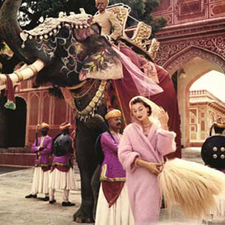
Anne Gunning in Jaipur by Norman Parkinson in 1956 (C) Norman Parkinson Ltd/Courtesy of the Norma Parkinson archive.
The Second Age of Beauty is Glamour by Cecil Beaton 1948
(C) The Conde Nast Publications.
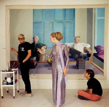
David Hockney, Peter Schlesinger and Maudie James by Cecil Beaton in 1968. (C) The Conde Nast publications.
Linda Evangelista at the International Collections by Patrick Demarchelier, 1991 (C) The Conde Nast Publications.
Claudia Schiffer in Paris by Herb Ritts, 1989. The Herb Ritts Foundation/The Trunk Archive (C) The Conde Nast Publications.
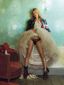
Kate Moss at the Master Shipwrights House in Deptford by Mario Testino, 2008 (C) Mario Testino.
Limelight Nights by Helmut Newton, 1973. Conde Nast Archives London, (C) The Conde Nast publications Ltd.
I'm also struck by the fascinating depth of articles in former Vogue's perhaps hedging more towards the coverage of rival Hearst title Harper's Bazaar these days. I wouldn't use the word academic necessarily but they explore topics in depth with a level of gravitas in the coverage that gave the readers insightful detailed reportage. Vogue in times past has covered a world beyond fashion to a greater degree. I was fascinated by the cover on display featuring Marisa Berenson with Helmut Berger and shot by David Bailey for the July 1970 edition of Vogue. It's great to see men and women together on a fashion magazine cover sometimes as fashion is such a part of our shared lived with other people.
Covering important social events such as the Chelsea Arts Ball that documents life within the arts community at a point in time sits amiable alongside the important War Photography of Cecil Beaton and Lee Miller. Vogue's place as a social historian, a diarist of our times, has I feel again been more pronounced in previous decades. Vogue through much of it's history hasn't been afraid to tackle the difficult subjects.
Vogue in the 1980's also ran an edition called Vogue Food which is a fascinating look at this part of the lifestyle market that has been reawakened. In the 1980's Grace Coddington was the styling Editor for Vogue in London with Lucinda Chambers as her Assistant. Vogue detailed scenes of life in London including the famous Anglo Saxon attitudes shoot of the early 1990's styled by Isabella Blow. Looking back at an earlier era of Vogue Terrance Donovan, David Bailey, Bob Richardson, Peter Laurie and Don Honeymoon shot scenes from across the country in urban settings sometimes starkly illustrating life away from the glamour capital of London. But Vogue is Vogue ad we return swiftly to the epicentre of the magazine's purpose, exploring beauty and design and how fashion allows us to express ourselves. The Vogue editorial shots enclosed are slices of life in the fashion world that in turn fire the imagination of the audience. A visit to Jaipur with all it's rich colours and life, time in the studio with David Hockney and Claudia Schiffer on the back of motorbike as if dashing between shows in Paris Fashion Week.
Three leading models of 80's/90's and millenium Linda Evangelista, Claudia Schiffer and Kate Moss above are amongst the galaxy of famous models who's images adorn the walls and also from the early 20th century there are a number of faces of women from the British Royal family such as Marina Duchess of Kent who, had they not been Royal, may have been models themselves. Life in the Fashion World is a hugely varied existence with the scenes captured in front of the camera immortalising only a small part of the life around the industry.
But the camera loves women and the aura of beauty that surrounds them. The female portrait has been a defining image of beauty for centuries and in it's current incarnation Vogue chooses to focus (perhaps a tiny bit too much for my liking) around this facet of fashion. In terms of Fashion Photography this exhibition is a fantastic tour to savour.
Walking the rooms slowly and being guided by what interests you. Don't feel that you can't re-visit a room if something comes to your mind. The portraits of stars and screen that line the walls as an ever present reminder of the wider industry that Vogue inhabits; proving as if where necessary that Vogue part of the modern popular culture. Grace Coddington in the image below has had an interesting dual career to date as a highly successful model and then a stylist rising to the top of the industry. It's wonderful to see someone do this, push their talent further and take a second step. Also it means you have an experienced stylist who has an incredible depth of knowledge about the industry over a greater period of time.
There is so much to absorb in this collection of work that Robin Muir ha so deftly curated. You feel like you are being shown a great treat from the magician's cupboard but also a gentle osmosis of a photography education seeps into your consciousness too in a way that's gentle and easy to digest. You see Vogue from all angles, a myriad of photographer's with different style and approach to their subjects all coming together to form the fashion tapestry of our lives that is British Vogue. Print, Digital and Social media are all now vying to hold our attention and be the 'go to' form of communication where once the Print edition was king. I think this multi-channel experience will stay with us and it's going to be wonderful to see the second century of British Vogue unfold.
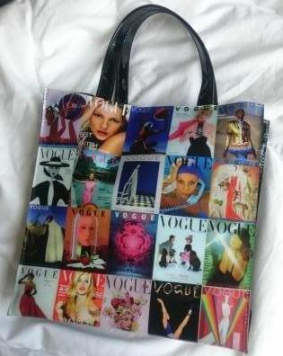
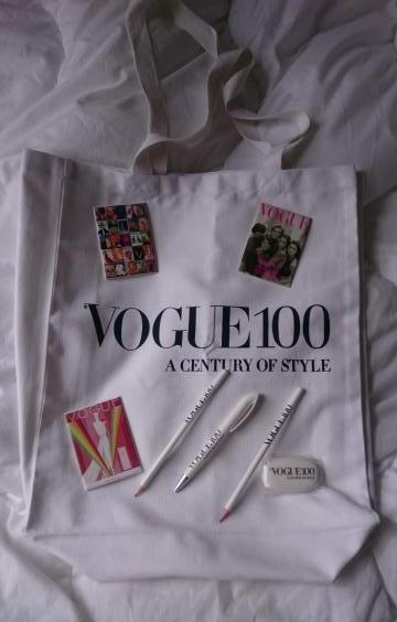
I'm usually well behaved in gift shops but not this time. There where so many wonderful fun things to pick up
that the pocket money budget went out the window. I have to say the magnets and bags where my favourite
things due to the intricacy of the design's using the Vogue covers. What an image treasure trove for your shop!